Jan 2019 - July 2022
ArchDaily
ArchDaily
Worked as a Product Manager (2 years) and Product Designer (1.5 years) @ ArchDaily, part of the DAAily Platforms (Designboom, Architonic, Archdaily) owned by NZZ Mediengruppe. ArchDaily is the world's largest architecture website, with +17.9m monthly users and +285m monthly page views. As a Product Manager, I led three core products: The Dashboard, Newsroom and the Job Portal. Previously, I was the sole Product Designer, where every single (new) screen was designed by me.
Product Manager · (June 2020 - July 2022)
Led and mentored a team of 6 Software Engineers; for 3 core products at the world's most visited architecture platform (18m+ MAU’s): Newsroom, Dashboard, and the Job Platform.
Created new revenue stream through Job Platform launch: Built and launched architecture job-seeking platform from concept to market, securing 150+ paying firms within 2 months including industry leaders like BIG and Foster & Partners.
Executed 0-to-1 B2B analytics product: Led complete development lifecycle of Dashboard project from research & design (as a Product Designer) to team building and delivery (as a PM). Delivered analytics for 450K+ product pages serving 200+ B2B clients, resulting in 200%+ MAU growth and 15%+ contract renewal rate improvement YoY.
Re-engineered content management systems: Overhauled ArchDaily's Newsroom for cross-platform compatibility with Architonic's Newsroom. Reduced article creation time by 50% and increased monthly article output by 30% YoY.
Newsroom
Our content team is the biggest team at ArchDaily (+50 editors), they use Newsroom to create and edit articles and publish architecture projects. Once we were incorporated into the NZZ Mediengruppe and started working with Architonic, we decided to re-vamp our own Newsroom and also make it available so that we could publish content into the Architonic site (cross-platform) to increase efficiency and to allow better collaboration.
Dashboard
One of the core products we offer our paying customers is the Dashboard where data that their products and brand generate inside of ArchDaily are showcased. We have over 300 paying customers (See here), which include the most important brands related to architecture such as (Autodesk, Bradley, Hunter Douglas, Sherwin Williams, Velux, + many more). Since we bring over 200m monthly page views, the data and connections we bring to our customers are of extreme importance.
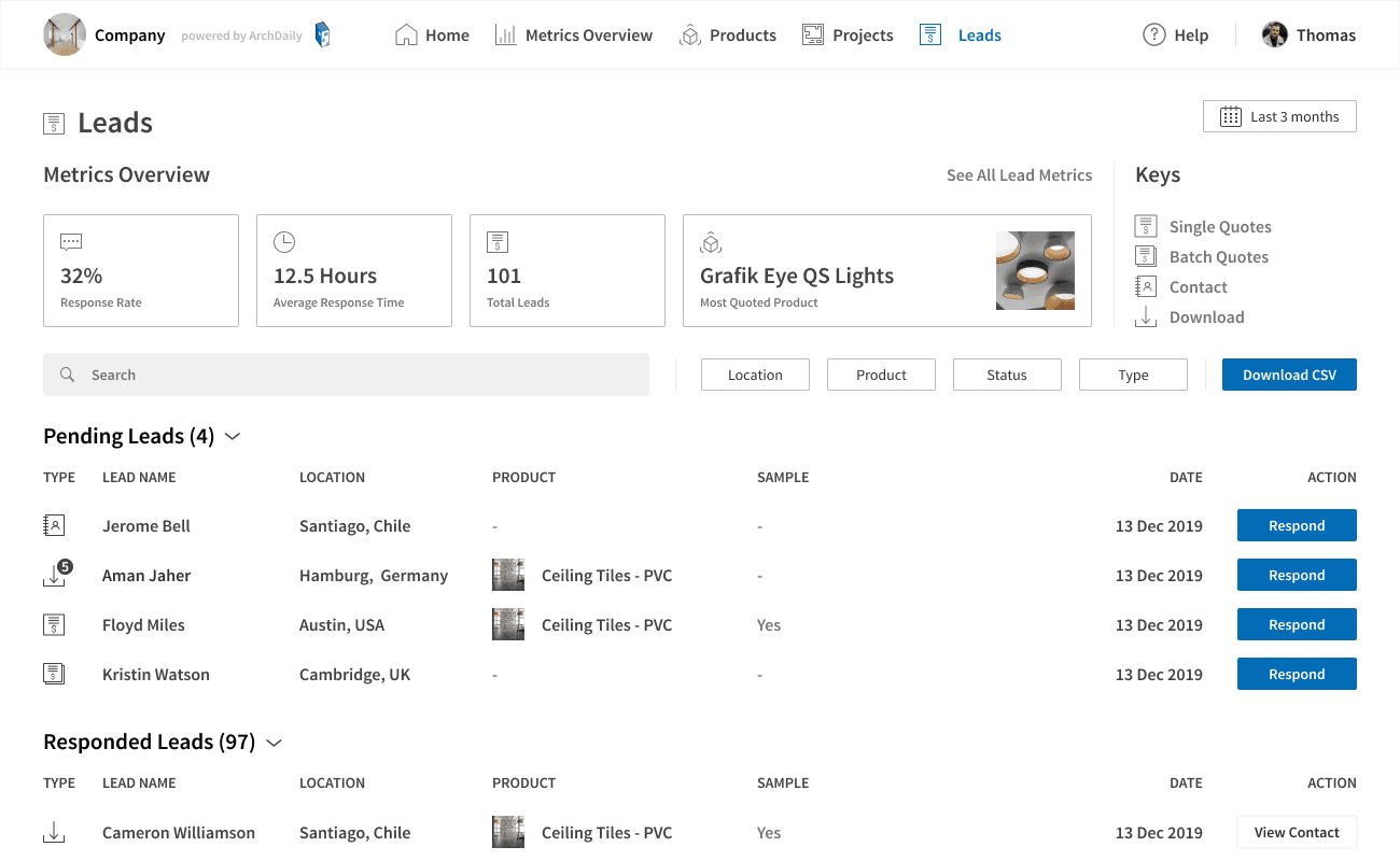
Our Dashboard wasn't the best at showcasing this, and so we set out to have a fully redesigned dashboard by the end of 2021, with new features (such as a messaging centre) to all new data/metrics to give our clients a deeper understanding of the users who are buying their products. Our first release was Feb 2021, MAU's have gone up by +200% YoY and we have received countless messages praising the upgrade. Interaction with data through filters and search has gone up +1350% YoY.
Some clients’ feedback:
"When we started with AD that was amazing, and now they did the relaunch with the new dashboard, and that’s exactly what I need. From the 10 different platforms that I use, this is the benchmark that has everything that I need .... when my boss asks me for recommendations from platforms is always AD ... That’s the benchmark for me."
"This email came in this morning and it is brilliant. I have already shared some relevant details of the stats with our dealers and keep encouraging more opportunities to highlight projects where — retracted — products are installed." (talking about alerts we automatically send to clients)
"10/10"
Old UI
New UI
Home

Projects View

Leads View

Main Metrics View

Product Designer · (January 2019 - June 2020)
Established Archdaily’s first Design System: collaborating closely with Engineering for seamless integration in handoff.
Transformed user acquisition: Revamped signup & onboarding - boosted 50%+ sign-ups and 20%+ sessions/user YoY.
Optimized core UX: Streamlined search and information UI, drove pageviews by 20%+ and bookmarks by 20%+ YoY.
Enhanced mobile experience: Reducing bounce rate by 10% and increasing mobile share by 10% YoY.
Projects
Signup/Login
Converted long-form version of sign-up into a step-by-step process. This used the famous "one foot on the door" technique, which made the user feel he was already making progress and there wasn't much left. This in turn increased our sign-ups by +50% YoY. The change was immediate.
Another project in the sign-up was the inclusion of interests. This has enabled us to use notifications as a new mailing strategy. We have seen a 2x increase in traffic from emails, resulting in a +20% YoY increase in session/user.
Search
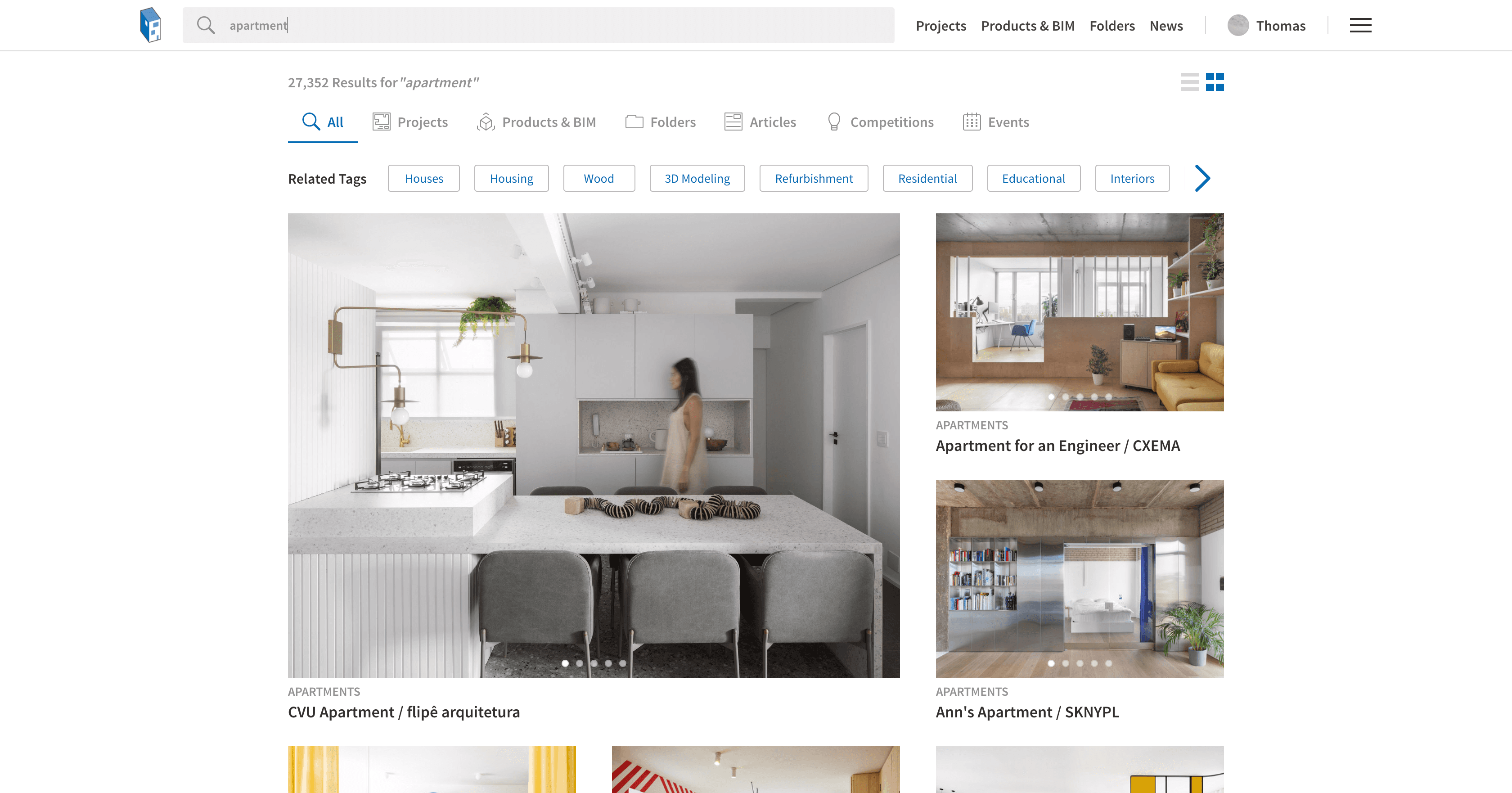
As my first project in ArchDaily, the new search for ArchDaily sought to replace the generic Google results with a more visual and user-friendly view (for architects, the priority of images over text). When redesigning the search it was important to maintain the ratio of architecture aficionados, and love. The famous golden ratio is so important to photographers too.

Singles
Singles are our most viewed pages in ArchDaily. They are the template for an architecture project. However, the main information of the project was being visually lost, as it was an unappealing "key:value" view. Therefore we set out to give it a cleaner look, with the use of icons and highlighting the clickable items. I designed every icon.

MyAD (bookmark & following section)
MyAD is the user-centered saving/bookmarking and following section of ArchDaily. You can follow entities (architecture firms, photographers, curators, architecture categories, etc...) and save and order items into folders (architecture projects, architecture products, interesting articles, competitions, events). The problem lied in that the navigation was not consistent with the whole of ArchDaily, as well as the UI with our design principles.

Homepage
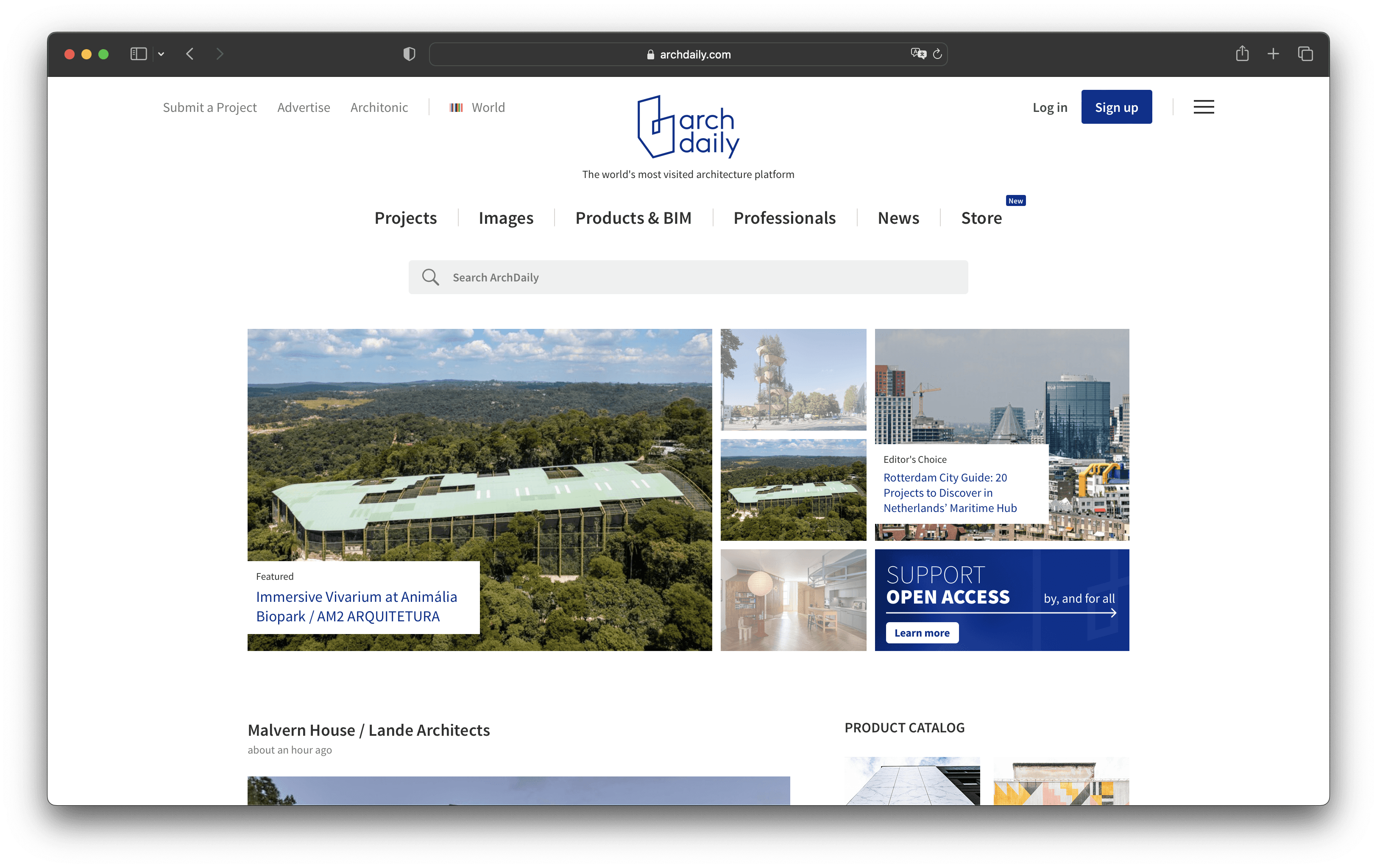
After years of continuous improvements and new features, ArchDaily's homepage was starting to look cramped up. There was too much information, too many navigation items, and it was causing our users to paralyze since there were too many options (Paradox of Choice). Furthermore, it was going against our key design principles, "less is more" and our key user, the architect, where space and minimalism are key aspects of their work. A new home was necessary, and so we built this:

Mobile UX
An important share of our traffic comes from mobile. In addition, our research showed that to access many pages in ArchDaily through mobile, it required more than 3 taps in average. We set out to simplify our navigation and showcase our new features (new search and information architecture). We added a bottom menu, a new hovering always viewable save button in singles, tabs for easier navigation in some areas such as MyAD, image grids to view saved items as a mood board of inspiration for architects.


Support our Mission
This project was focused on fostering our huge community of architects. We gave users three possibilities:
Share a message of LOVE to our ArchDaily Love Wall
Submit their own architectural project
Submit their own article (related to architecture)
The feedback we got from this project was amazing! From famous architects (Starchitects) to people just starting and from all over the world. We have published countless projects that have come from this campaign as well.

Architecture Offices / Entities Landing
After many years without any changes, our main core users, architects, needed a revamp of their landing pages. A page where they could showcase all of their projects and main info about them (bio, social media, contact info, main metrics, awards).
Old landing

New landing

